
Ori
Ori Story
Project Overview & The Mission
Managing modern personal finance is a fragmented, multi-app headache. The average user routinely juggles a traditional bank for checking, separate peer-to-peer platforms (Venmo, PayPal, Zelle) to split bills, a credit card app for billing, and a separate online broker just to access competitive High-Yield Savings Account (HYSA) rates. Bouncing between isolated ecosystems creates unnecessary friction, mental fatigue, and a disconnected view of daily cash flow.
ORI was designed to bridge this structural gap. It acts as a streamlined, all-in-one financial ecosystem that merges social peer-to-peer payments with robust banking functionality—including checking accounts, automated savings, and an integrated HYSA. By consolidating these fractured pillars, ORI eliminates digital clutter and empowers users to manage, save, and transfer capital from a single unified interface.
Role
- Finance Product Design
- Adobe XD, Illustrator
- April 2026-June 2026
- User Research, Interaction, Visual design, Prototyping & Testing
Visual Layout
Core Pillars
The Split-Second Send
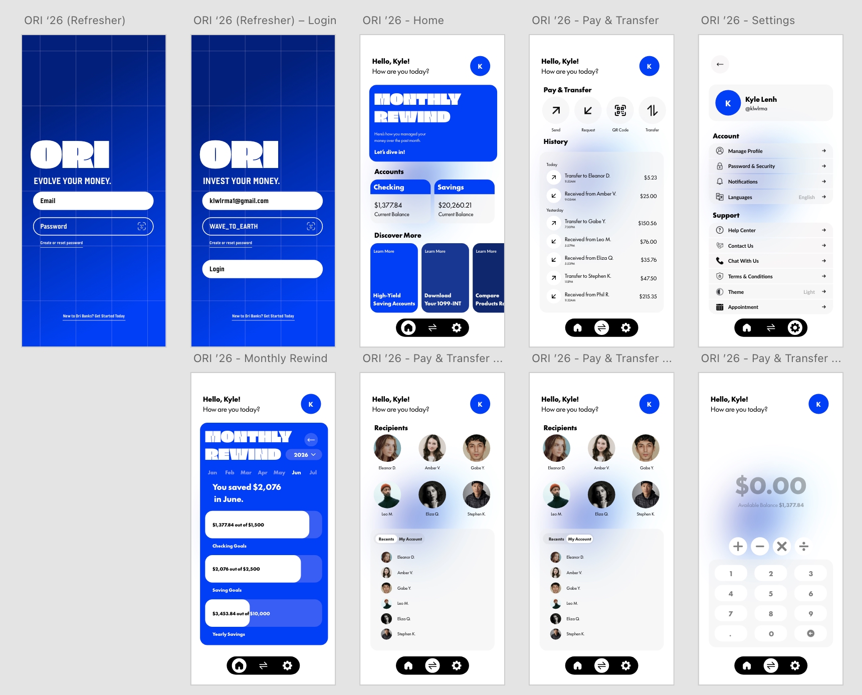
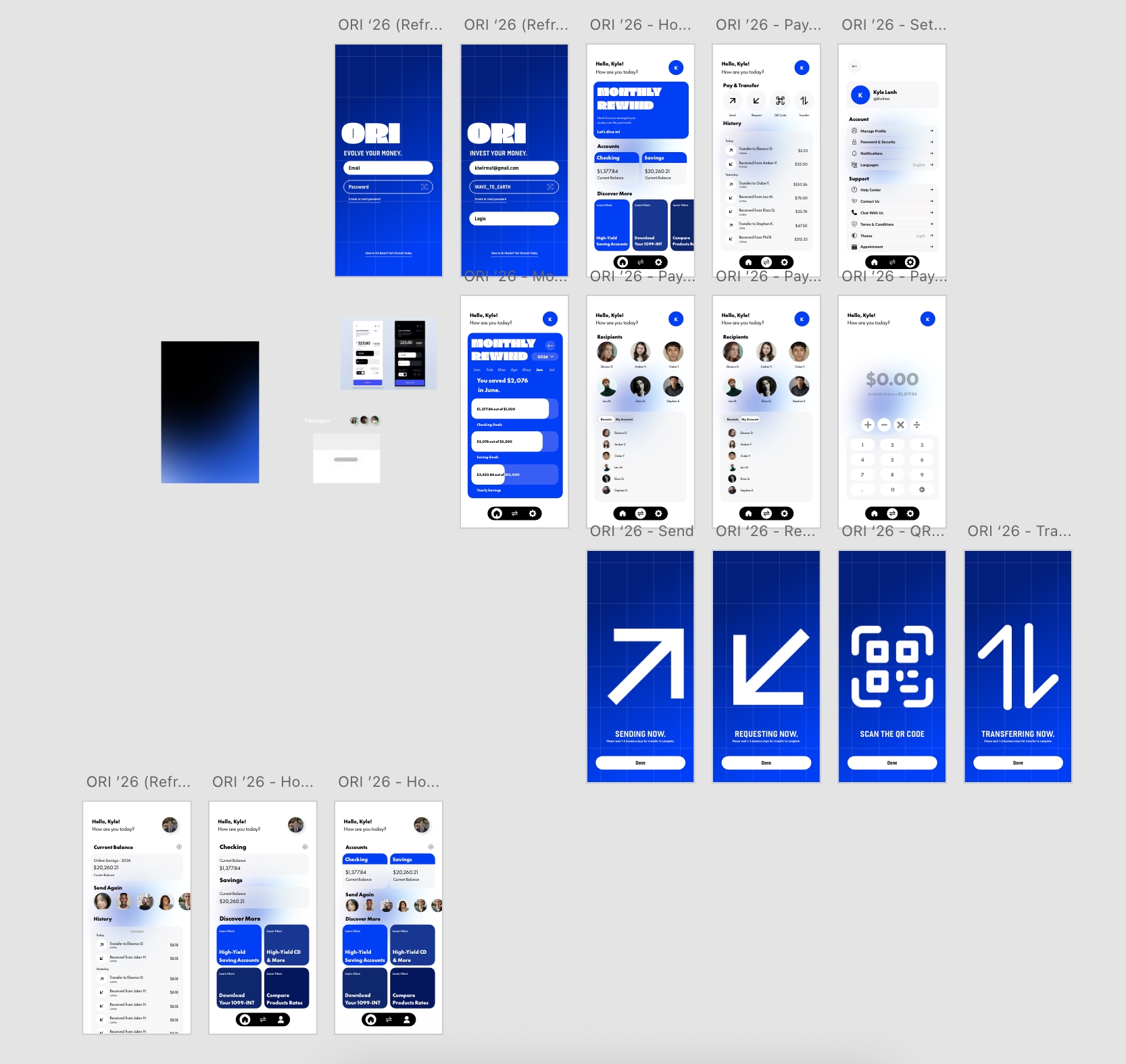
A centralized, two-tap action hub engineered for rapid capital movement. The interface dynamically adapts based on the recipient—utilizing casual, low-friction request flows for personal friends while generating structured, professional invoices for certified business vendors.
The Multi-Tiered Vault
A unified account overview that visualizes the user’s entire financial blueprint on a single screen. It cleanly segments checking accounts (for daily debit spending) and short-term savings goals, while clearly prioritizing the High-Yield Savings Account (HYSA) by displaying real-time interest accumulation.
Smart Automation Engines
A rule-based feature allowing users to seamlessly auto-route incoming peer-to-peer transfers. For example, when a user receives a rent reimbursement, a pre-set rule instantly slides 20% directly into their HYSA, converting passive income into automatic wealth generation.
Strategic Workflow
Understanding The Problem
Modern personal finance suffers from acute app fatigue and fragmented workflows. Users are forced to constantly juggle assets across isolated platforms—waiting for peer-to-peer transfers to clear in traditional checking accounts before manually routing them to external high-yield savings vehicles. ORI was created to eliminate these digital walls by solving two critical UX pain points: removing the heavy transactional friction when paying casual friends versus formal business vendors, and unifying disconnected balances into a single, cohesive financial view.
The Solution
ORI resolves this ecosystem fragmentation by introducing a unified financial canvas built entirely around user speed, accessibility, and clarity. The interface strips away the dense corporate jargon, hidden fee structures, and labyrinthine navigation systems characteristic of legacy banking platforms. In their place is a fluid, high-velocity dashboard that treats money movement as a single, continuous user flow.
By natively bridging peer-to-peer social transactions with high-yield savings structures, the solution completely eliminates the multi-day clearing delays and cognitive load of app-switching. The result is an intuitive, frictionless digital home that makes sophisticated cash management feel effortless for everyday users.
UI Architecture
Traditional banking dashboards are notorious for burying critical features beneath labyrinthine menus. To optimize task velocity in ORI, I implemented a streamlined tab-bar navigation system anchored by a persistent, centralized Action Button. Strategically placed within the natural “thumb zone,” this layout ensures that sending, requesting, or routing capital remains an immediate, effortless interaction from any screen in the application.
Intentional Typographic Hierarchy
Fintech interfaces demand a deliberate balance of visual credibility and modern accessibility. If a layout leans too playful, users hesitate to trust it with their savings; if it feels too clinical, they abandon it for simpler alternatives. The visual language of ORI was meticulously engineered to bridge this gap.
- Main Header (Fat & Placa): Paired exclusively on the authentication/login screens to create a bold, memorable brand introduction.
- Subheaders (Futura 100): Utilized across functional sub-headers to provide a geometric, modern structure to data fields.
- Body Text (Lato): Deployed as the primary body typeface for sub-pages to guarantee absolute legibility and optimal scannability for transactional data.
Strategic Color Palette
Built upon a foundation of secure Electric Blue complemented by professional slate-blue tones and a clean, high-contrast white backdrop. This palette evokes a sense of modern security and financial stability without feeling sterile.
- Secure Electric Blue
- Monochromatic Blue Shades & Crisp White Space
- Design Intent: Establishes instant visual authority, clarity, and safety across all dashboards.
Project Reflections
Lessons
Designing a comprehensive banking platform like ORI underscored the critical importance of designing for ultimate clarity under dense information loads. Safely displaying account numbers, transaction histories, and real-time interest yields within a compact mobile viewport requires an intentional balance of data density and visual breathing room. This project forced me to practice extreme visual restraint, proving that minimalism in fintech UX isn’t just an aesthetic choice—it is the foundational key to establishing user trust and confidence.
Key Takeway
- Data-Dense Minimalism: When handling complex financial data, generous whitespace is a crucial tool to prevent cognitive overload and guide user focus.
- Designing for High Trust: Clean visual hierarchies and transparent layouts directly reduce user anxiety, converting dense metrics into clear, actionable insights.
- Information Scannability: Stripping away visual clutter ensures critical transactional details remain immediately clear and error-free on compact screens.
