
Planter
Planter Background
Project Overview
Planter is an impact-driven digital journal born from a simple realization: nurturing your mental health is exactly like caring for a plant—it requires consistency, patience, and intentional care. To encourage long-term journaling habits, the app blends personal growth with global sustainability. For every 30-day journaling streak a user achieves, Planter funds the planting of a real, physical tree somewhere in the world, turning daily reflection into tangible environmental impact.
Role
- Self-Reflection Product Design
- Adobe XD, Illustrator
- January 2026-March 2026
- User Research, Interaction, Visual design, Prototyping & Testing
Spatial Layout
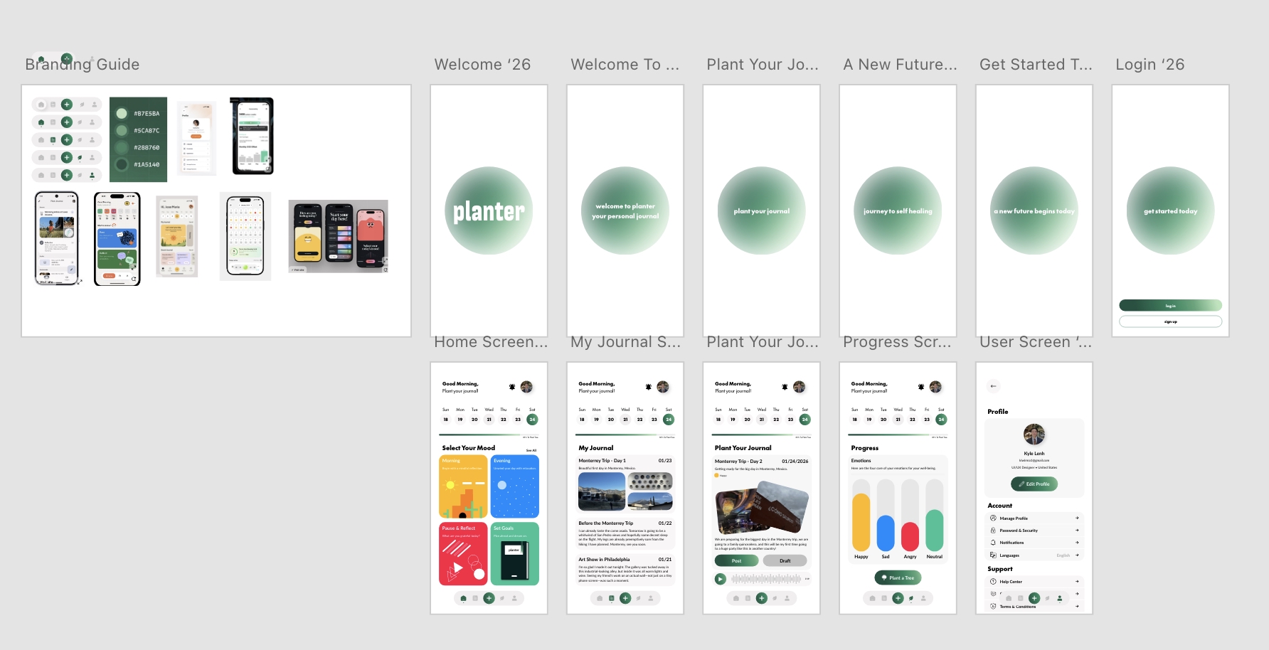
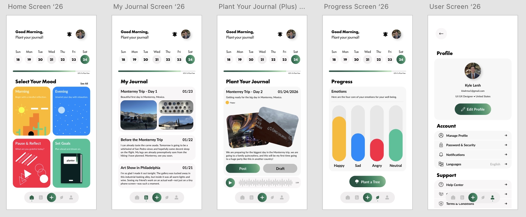
Core Value Drivers
The Digital Sapling
To incentivize long-term habits, each 30-day journaling cycle begins with a digital seed. Every daily log fuels the plant’s growth interface, providing immediate, rewarding visual feedback. Upon hitting the 30-day milestone, the digital plant fully matures, triggering a real-world tree planting through a partner organization.
Multi-Modal Entry
Recognizing that users experience varying emotional states, the entry interface supports diverse, multi-modal inputs. Users can upload photos, type text, or record voice notes directly into their logs. If writing feels overwhelming, voice-to-text and audio logging allow users to reflect without the barrier of traditional typing.
Insightful Progress Tracking
A dedicated progress dashboard allows users to intuitively track long-term emotional trends across four core well-being metrics. By transforming qualitative feelings into clear, digestible data visualizations, the interface gently encourages self-awareness and habit retention on the user’s own terms.
The Approach
Understanding The Problem
While daily reflection is highly therapeutic, building a sustainable journaling habit presents a steep friction point for users. Traditional journaling applications often feel transactional and detached, offering little engagement beyond a blank text field. As a result, users download these apps with strong intentions but quickly abandon them due to a lack of meaningful motivation, immediate feedback loops, or tangible rewards.
The Solution
Planter transforms daily emotional reflection into a nurturing, gamified experience. By bridging behavioral design with environmental action, the app combats user drop-off and incentivizes long-term consistency. Users are motivated to build lasting wellness habits through a tangible, real-world reward system: turning daily reflections into a real, living tree.
The Anatomy of Planter
If an app takes more than 60 seconds to use, people will drop it because it’s not accessible. I designed the check-in flow to be as frictionless as possible. When you open the app, it greets you with a warm prompt asking how you are doing. With three quick taps, you can log your core mood, pick a few emotion tags, and type a quick reflection before saving.
Typography
The typography for Planter was selected to balance a playful, organic personality with clean, modern readability. By pairing a distinct, character-forward headline typeface with highly structured geometric and humanist fonts, the hierarchy maintains an approachable yet deeply intentional product feel.
- Main Header (Mazurquica VF): Used exclusively for hero sections and major landing headers. This bold, condensed, and expressive typeface gives Planter its unique visual identity, injecting an organic, grounded, and memorable personality right from the first interaction.
- Subheaders (Futura 100): Leveraged for feature titles and section headers. The sharp, geometric architecture of Futura introduces a crisp, modern aesthetic that perfectly balances the expressive nature of the main headers, establishing a clear and structured visual hierarchy.
- Body Text (Lato): Utilized for all interface copy, descriptions, and user inputs. As a warm, humanist sans-serif, Lato ensures exceptional readability and legibility across all screen sizes. Its friendly, rounded details keep the journaling experience feeling soft, accessible, and inviting.
Color Palette & Visual System
To evoke a sense of calm and mindfulness, the visual system intentionally rejects clinical, harsh blacks and blinding white backgrounds. Instead, it embraces an organic, earthy palette modeled after the natural world. Every tone was selected to cultivate a serene, stress-free digital environment that feels safe and inviting for daily emotional reflection.
- Sage Green (Primary Accent): Evokes growth, restoration, and emotional balance, grounding the app’s identity in nature.
- Calming Terracotta (Secondary Accent): Adds a rich, earthy warmth for interactive elements, milestones, and highlights without introducing high-stress alert colors.
- Mindful White (Background / Canvas): Creates an open, breathing interface that mimics a fresh sheet of paper, removing digital clutter so users can focus entirely on self-reflection.
Growth & Insights
Reflection
Designing Planter taught me a powerful lesson about user psychology and habit formation: micro-incentives work. By shifting the reward of journaling from a purely internal emotional benefit to an external, tangible world-benefit, user motivation skyrockets. It was an invaluable exercise in balancing analytical data tracking with an emotional, highly rewarding user interface.
Key Takeway
- Purpose-Driven Gamification: Tying a 30-day journaling habit to a real-world tree planting provides the exact external motivation needed to sustain long-term consistency.
- Balancing Logic and Emotion: A successful wellness app must beautifully balance analytical data tracking (mood metrics) with an emotional, rewarding user interface (the growing sapling).
- Designing for Cognitive Load: Providing multi-modal inputs ensures that users can easily maintain their daily habits even on low-energy days when typing feels overwhelming.
