
Youniverse
Youniverse Redesign
Project Overview
Youniverse is an immersive cosmic lifestyle app designed to turn complex astrological data into personal, actionable insights. This comprehensive redesign overhauls the 2021 MVP, transforming a dense and rigid layout into a fluid, user-centered digital ecosystem.
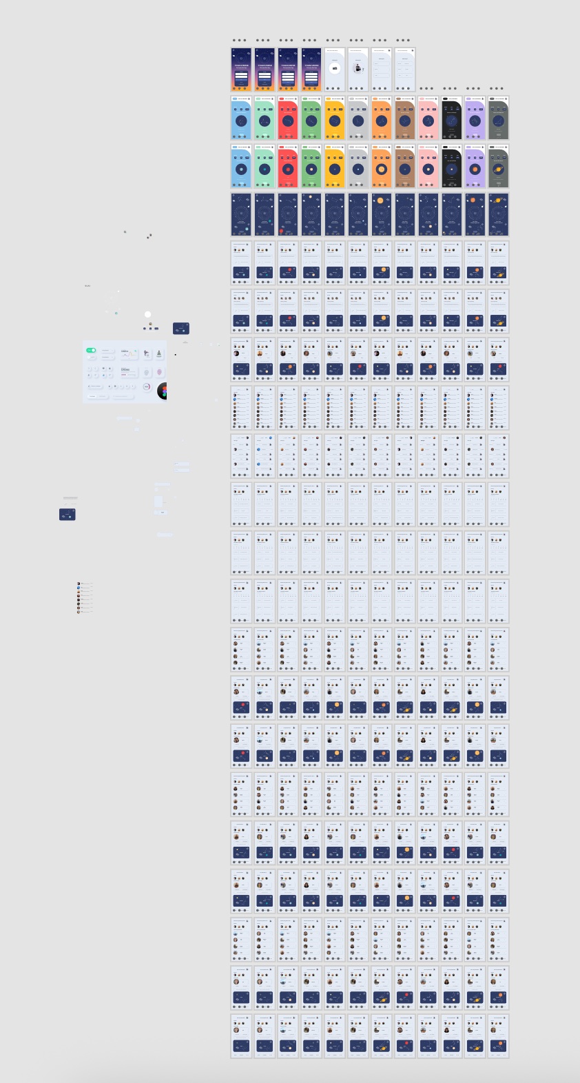
When looking back at the original 2021 version, the interface suffered from severe information density—cramming data onto a single scrolling page and locking users into only one compatible zodiac match. Returning to the project, my goal was to eliminate this cognitive overload, open up user freedom, and build a frictionless flow that drives daily engagement.
Role
- End-to-End Product Design
- Adobe XD, Illustrator
- August 2025-October 2025
- User Research, Interaction, Visual design, Prototyping & Testing
Layout Comparison
2021
2025
Visial Hierarchy
Features I Focused On
Reducing Cognitive Overload
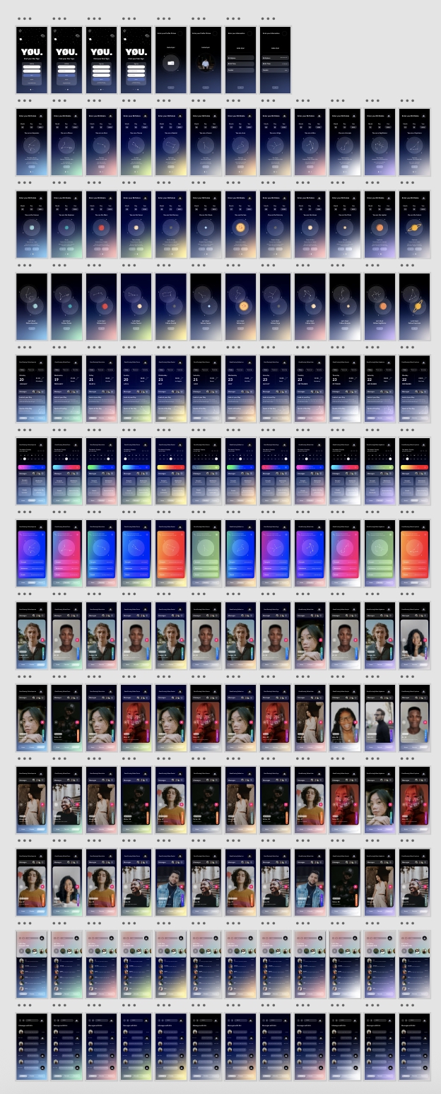
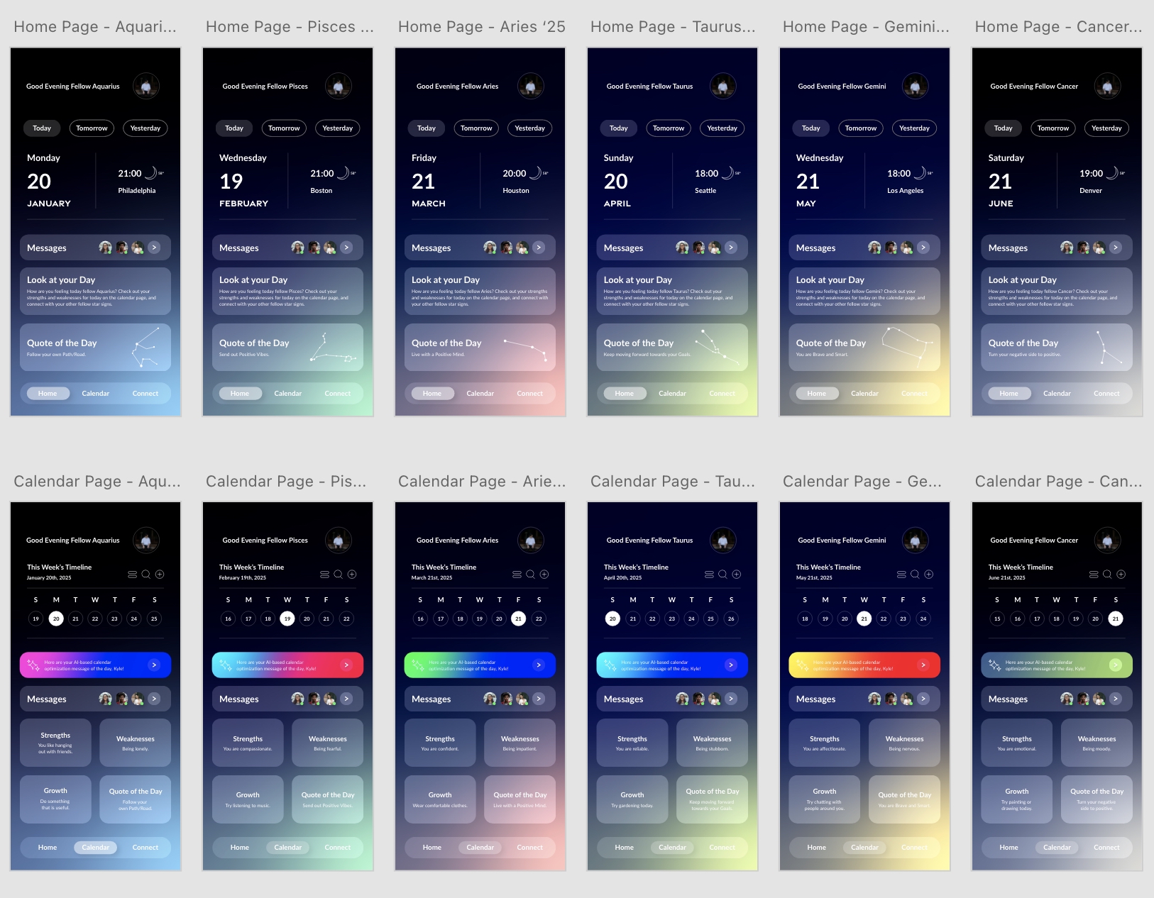
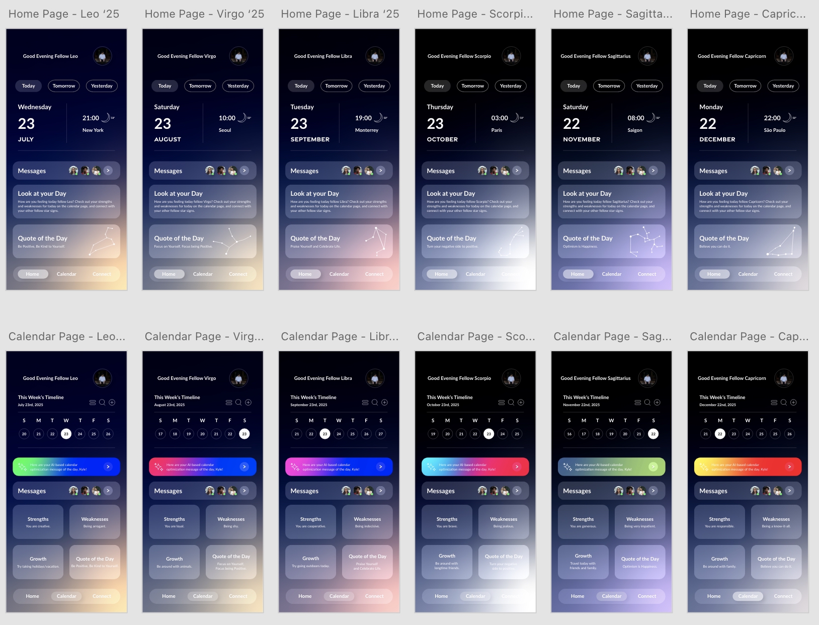
Rather than forcing users to wade through a sea of unorganized data, I designed a scannable daily dashboard. It delivers a quick look at the day ahead, key cosmic trends to keep in mind, and actionable ideas to brighten the user’s day. By optimizing the information architecture, the content is now light, easy to read, and fully digestible in a matter of seconds.
Prioritizing User Autonomy
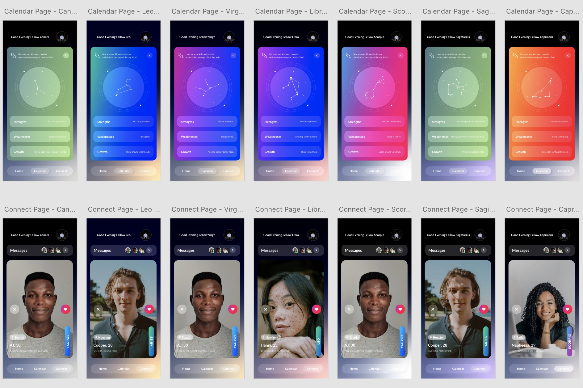
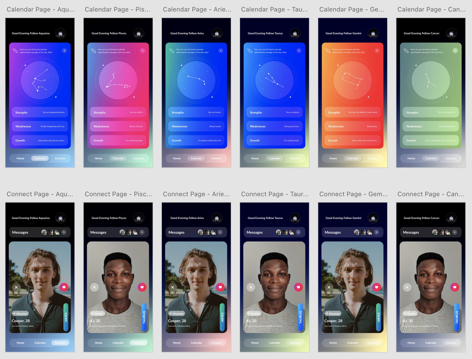
The rigid 2021 framework artificially limited exploration by only matching users with their single most compatible sign. To grant users complete control, I overhauled the logic and UI of the compatibility feature. Users can now select any sign in the zodiac to instantly map their connection, spot potential friction points, and gain clear insights into what areas can be constructively worked on together.
Eliminating Navigational Friction
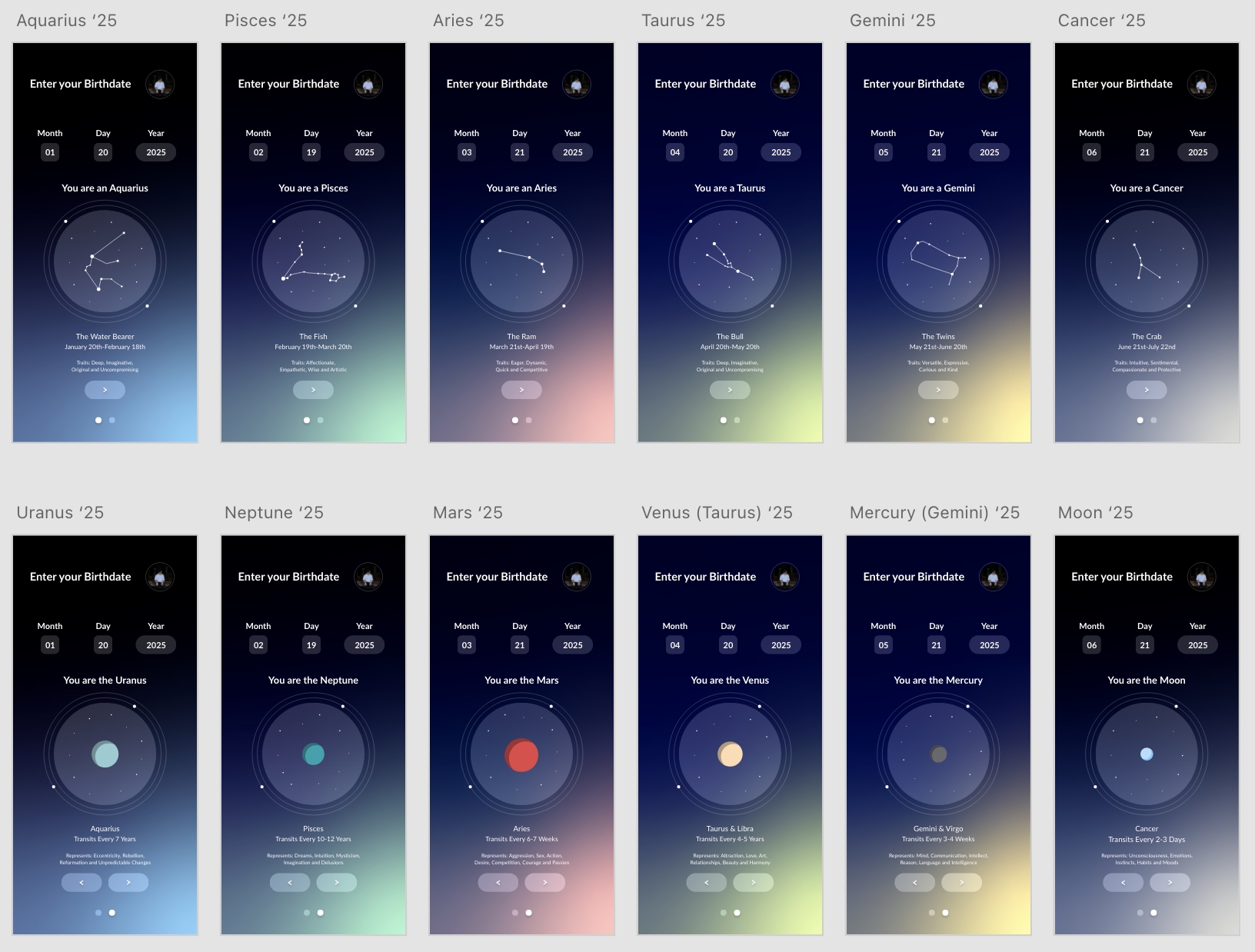
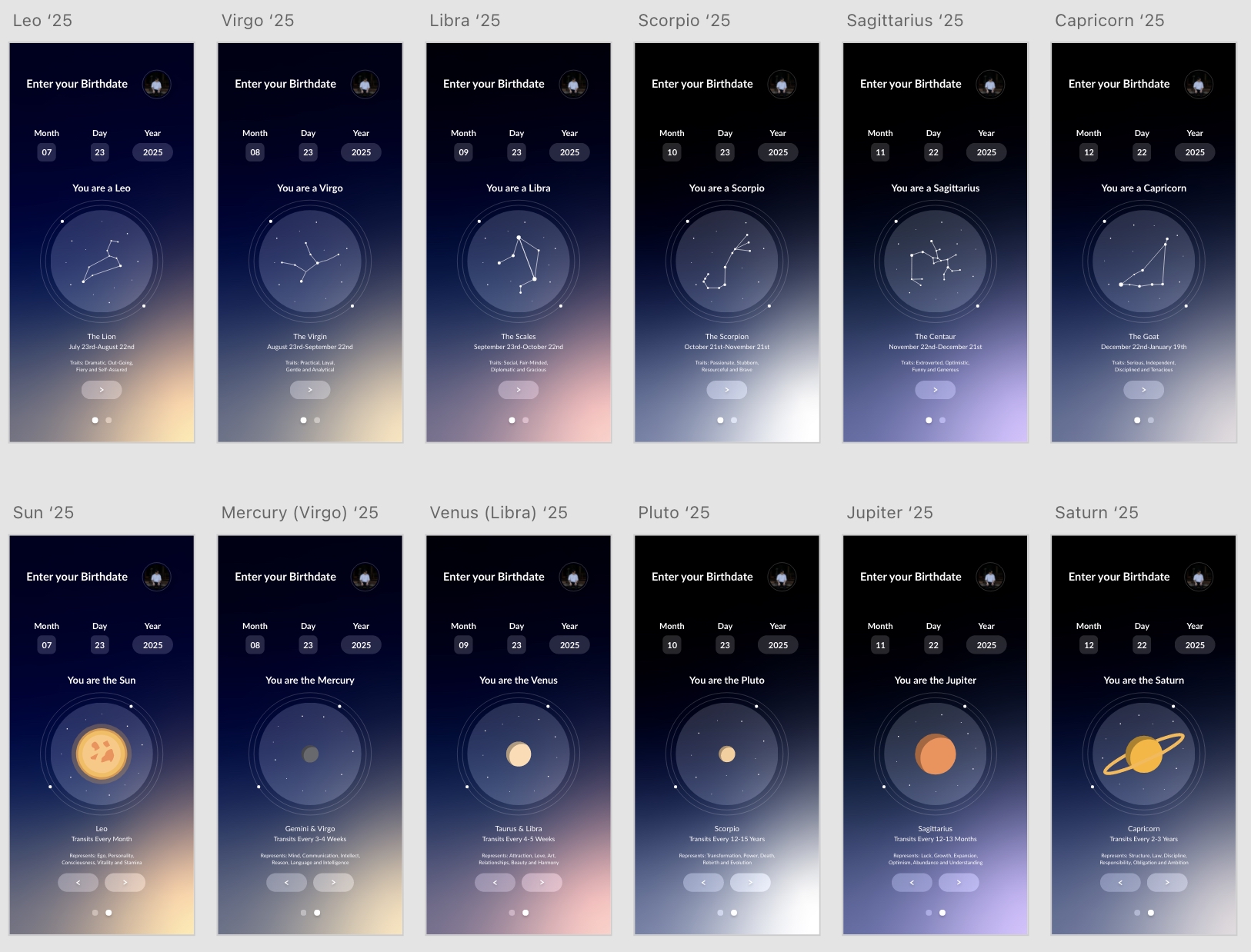
Overhauling the entire application allowed me to rebuild the user journey from the ground up. I focused heavily on streamlining the transitions from the initial login screen, through the home dashboard, and straight into the compatibility engine. By replacing the confusing, single-page infinite scroll with a clear tab structure, the new flow provides a crystal-clear path that boosts daily engagement and eliminates dead ends.
The Process
Understanding The Problem
In the original version, everything was crammed onto a single, never-ending scrolling page. For the redesign, I broke that data down and split the app into three clear, straightforward tabs: the Home dashboard, the Calendar, and the Compatibility Engine. Restructuring the layout this way completely transformed the flow, making the entire experience feel lighter and much more accessible.
The Solution
The redesigned Youniverse ecosystem transforms complex, intimidating astrological datasets into an intuitive, visually stunning experience. By intentional restructuring, the new interface eliminates cognitive friction—replacing a daunting learning curve with a welcoming, accessible environment that encourages effortless daily exploration.
What Changed?
Restructuring the Layout
In the original version, everything was crammed onto a single, never-ending scrolling page. For the redesign, I broke that data down and split the app into three clear, straightforward tabs: the Home dashboard, the Calendar, and the Compatibility Engine. Restructuring the layout this way completely transformed the flow, making the entire experience feel lighter and much more accessible.
Balancing Light & Shadow Work
When the user experience feels natural and digestible, it opens up a whole world of possibilities. Users shouldn’t have to stress over how to read their information or navigate the screens. Stripping away that confusion allows them to actually focus on using the data to work on themselves and grow connections with other users.
Creative Direction & UI Details
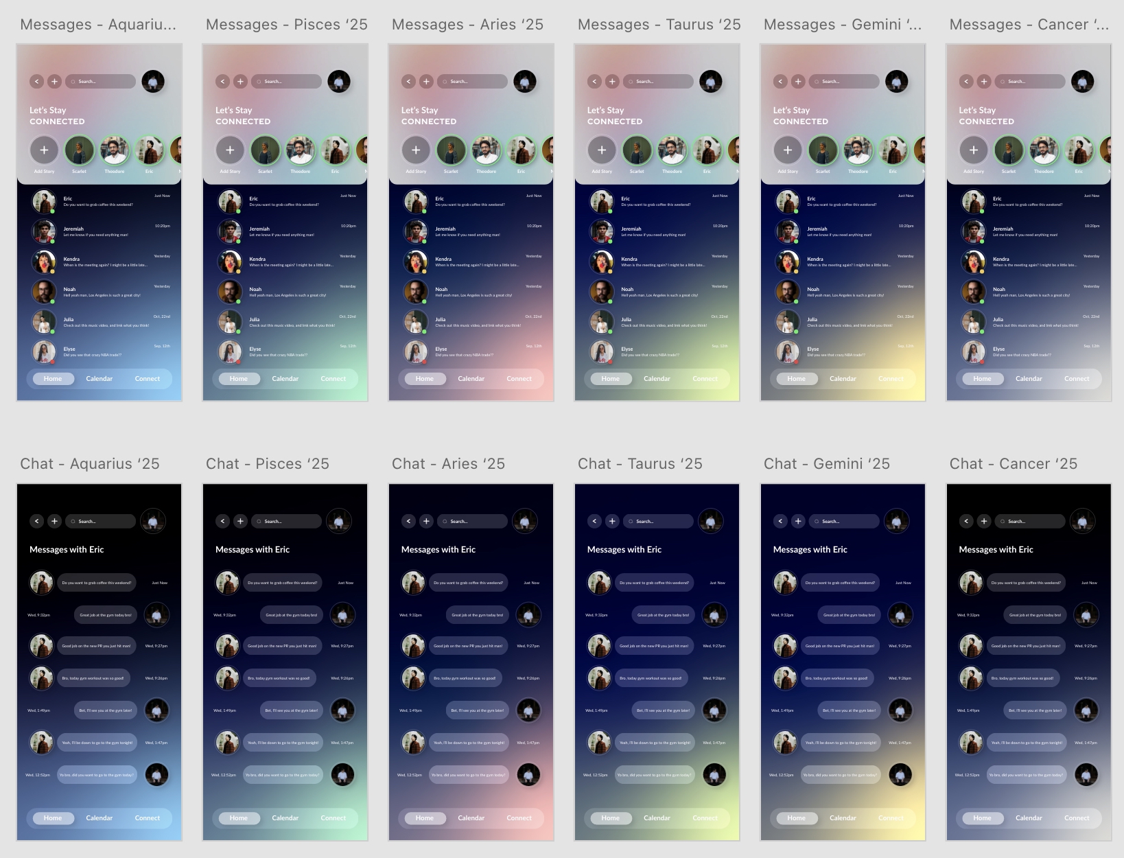
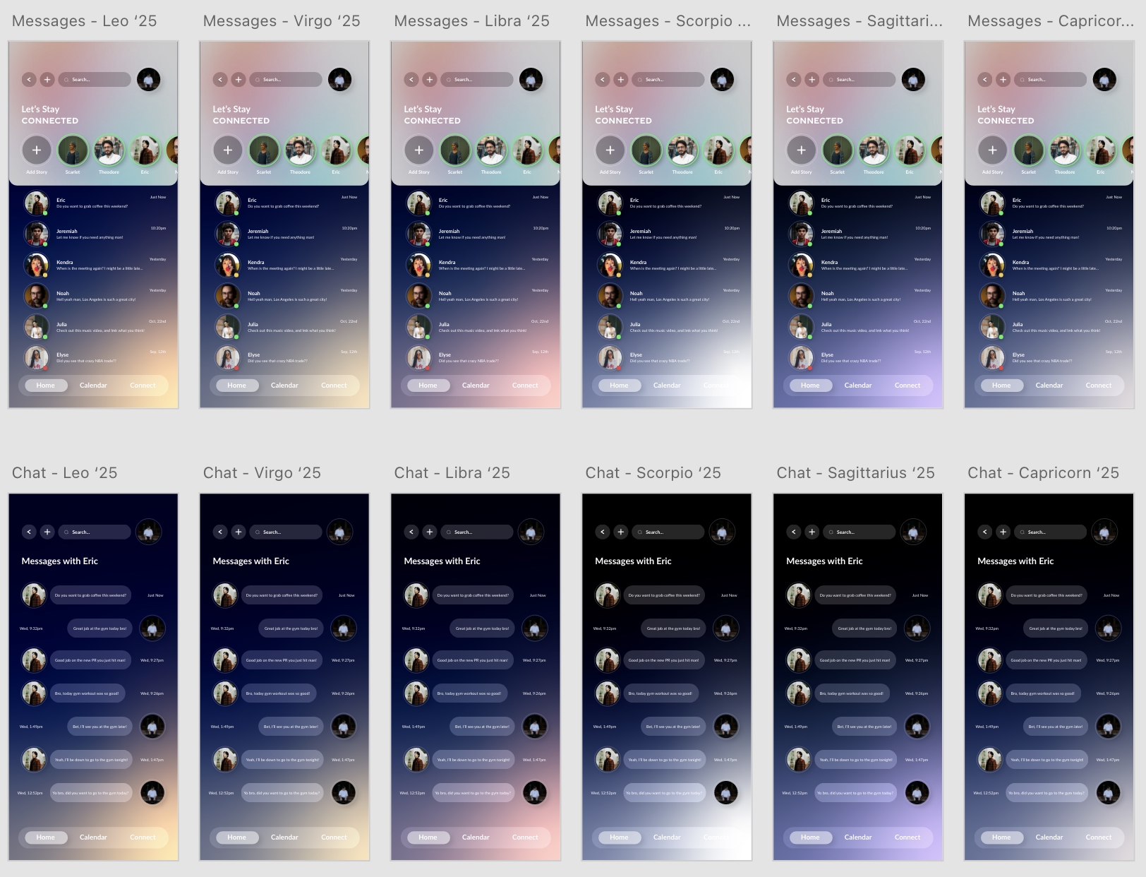
To transform Youniverse into a deeply immersive digital sanctuary, the visual direction was anchored in a premium, modern dark-mode aesthetic. Every asset was intentionally designed to evoke a sense of high-end editorial curation while ensuring the product remained highly accessible and functional during late-night usage.
Typography
The typographic hierarchy bridges the gap between the mystical and the modern, establishing an editorial and high-end tone:
- Headers (Gravesends Sans): Utilized to give the application an avant-garde, structural, and slightly celestial presence. These bold, geometric weights ground the layout and mimic premium, luxury print journalism.
- Body Text (Lato): Paired deliberately to maximize long-form legibility. Lato’s warm, rounded traits balance the sharp geometry of the headers, ensuring that dense text blocks and personalized data streams are incredibly easy to scan and digest under low-light conditions.
Color Palette & Visual System
The color strategy relies on high contrast to establish an immediate visual hierarchy and separate complex features at a glance:
- Deep Space Obsidian Backgrounds: Serves as the canvas for the ecosystem. The near-black interface minimizes eye strain during nightly reflection periods and makes foreground elements pop.
- Intentional Feedback: Micro-interactions and subtle state changes guide the user's eye naturally down the page, turning what could be an overwhelming dashboard experience into an elegant journey through personal data.
Reflection & Key Takeaway
Reflection
Revisiting my 2021 work provided a powerful benchmark for my growth as a designer. While my early approach focused heavily on visual trends and aesthetics, this redesign challenged me to design with deep structural intent. I learned that impactful UX isn’t just about making an interface look beautiful—it’s about defining the exact rationale behind every component’s placement and understanding how to architect sensitive, personal data into an experience that feels empowering rather than overwhelming.
Key Takeway
- Simplicity is always best
- Clean spaces for the user
- Giving the user the freedom to explore at their own pace
